When to show error messages
Remember you made a typo entering a password the last week? Lol, me too! People make mistakes and… it’s all right. It’s an unavoidable part of our human nature. As designers, the best we can do is to design the user experience so there are no errors at all. However, it’s not always possible.
A form is a common way to ask users about anything. It consists of different fields, and people make mistakes while completing forms. In such situations, we provide clear, straightforward and understandable messages to help users to correct mistakes. But before we need to make sure that there is an error at all.
Form validation is a process of ensuring that entered data satisfies input criteria. It’s a simple tool which we tend to underestimate and pass immediately to the issue of clear error messages. Even though we can validate forms in a variety of ways to enhance error handling much more.
Instant validation
Instant validation occurs as the user is typing or interacting with the field. This type is a little tricky. For the most part, we shouldn’t use it to show error messages. I believe everyone has faced the situation when you don’t even start typing your name and the form already yells “This field is required!”
Conversely, use instant validation to tell the user what he’s doing right. If you have special rules, show them before the user submits the form. Clear requirements simplify entry.

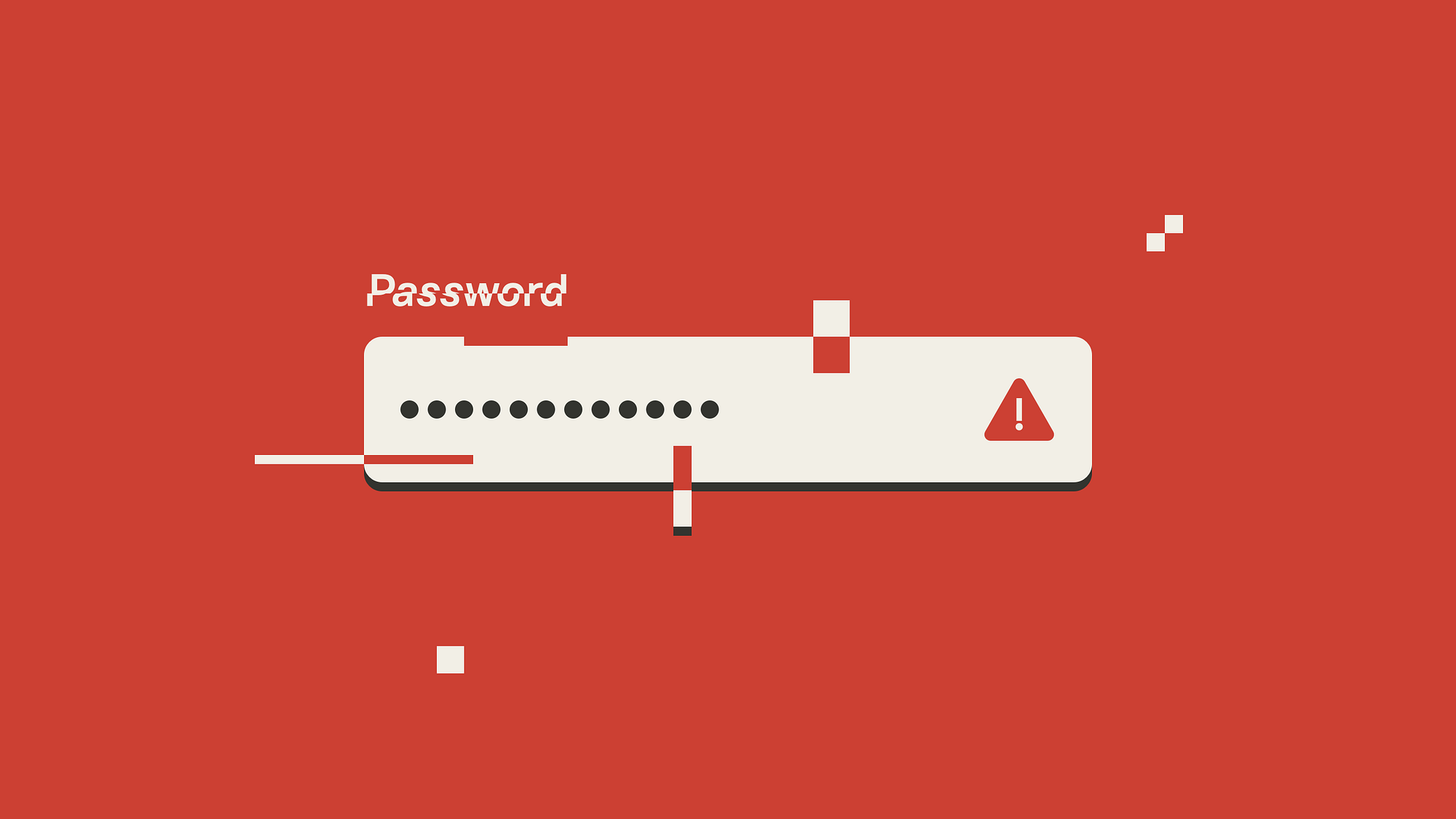
Strength indicators motivate the user to create stronger passwords and get higher appreciation.

Instant validation is a good way to guide the user to the right entry. It makes the process more efficient and helps to avoid errors.
Loss of focus
This type of validation checks entry just after the user removes focus from a field. Unlike instant, loss of focus validation doesn’t interfere with the process and disturbs the user after he finishes entering data.

We can even correct mistakes in fields that have a format. Indeed, don’t make users think — do it for them!
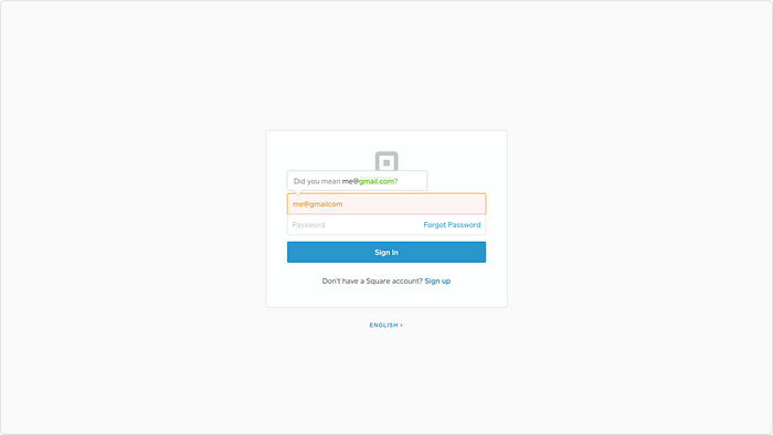
Loss of focus validation is applicable to everything we can process without sending user’s input to the server. However, don’t validate empty fields. We shouldn’t blame the user if he wants to fill in the field later.
Loss of focus validation lets us respond in the right time and point out a mistake before the user shifts attention to another field.
Form submission
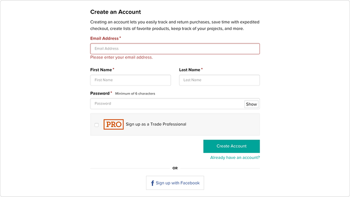
Don’t waste user’s time by sending obviously invalid data to the server. When the user submits the form, always validate it before sending data to the server. Generally, this type of validation should work as a reminder if the user forgets to enter anything.
Most websites don’t use the loss of focus validation at all and look for errors after an attempt to submit the form. And still for long forms with complex fields that approach increases the time to correct mistakes.
Server-side validation
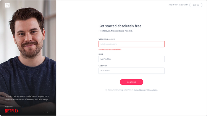
If the browser cannot find any errors, it allows to submit the form and send user’s input to the server. The server responds to the browser’s request and, for example, authorise the user. But the server also can find that the user entered the wrong password or there is even no account registered with this email address. Then the server sends an error message back.
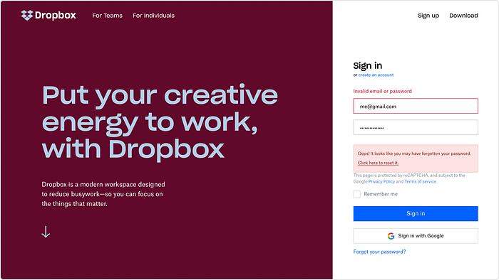
Server-side validation is a secure way to validate user’s input and, of course, we can use it as the only method to validate the form. But in this case, the user has to fill in and submit the form to get a response. To improve the user experience and reduce the load on the server, it’s better to use the methods above along with the server-side validation.
Provide error messages when users need them
A good user experience consists of different aspects. Writing clear error messages is important, but we also need to think about when to provide the feedback. Errors are frustrating, let’s do our best to help users to overcome them!
Tip: Instant validation is done using Regex (Regular Expressions), which could be tricky, use online tools to generate Regex easily.
Don’t forget to check the design guide to iOS and Android app icons and to find out how to design an accessible user interface. You can find more stuff from me here: Dribbble, Behance, Instagram, Medium.