Font Sizing for UX Designers — Part ONE

Let’s face it — you don’t have a clue as to why you picked any of the font sizes for your digital platform. If it was merely a gut-feeling, you deserve to be spanked in the gut. You’ll have all the right kinds of gut feelings after that. And that is why this week we are hitting you with another savagely fun and purely informational, yet comical, satirical, and eloquently lyrical article on what we believe is good design. All of which is probably completely off, or — completely a home run. And this first part is allllll about font sizing because believe it or not, there is a lot of factors that come into play when deciding font sizes. So without further adieu, let’s prevent us from kicking you in the gut 🙂
Font Sizing At A Glance
Hah — the puns, they never end! No seriously — today’s topic is about glancing. And font sizing is a big part of that. According to the all-knowing “MIT” of the UX world, Nielson Norman Group (NNG), a glance describes the event for when a user quickly reads short text that is about 1–2 words long. And with those 1–2 words, the user is capable of making a decision to progress in their journey. Let’s take a look at two common examples that you’ve definitely come across.

When was the last time you looked at a navigation bar? Probably a minute ago. Did your navigation bar have labels or icons or both? If it did have a label, at the very least, guess what — you made a decision by at the text label of the navigation bar. Good navigation bars use labels that are consistent in the number of words used throughout each navigation item. Some times you’ll notice navigation item labels that are 3+ words, and therefore appear much longer than the other navigation item labels used in the same navigation bar. Not only does this make the overall navigation bar design look inconsistent and awkward, but it is troubling to our simple minded humans that we’re designing for.

Another great example of based text are tabs or shelf elements found on mobile apps. Usually these include icons with or without text, but in this case we’re just talking about the ones that include text. A great tab or shelf label uses 1 word that perfectly summarizes the main point of that particular section (such as “Settings” or “Alerts”).

Importance of Glanceable Text
Well — for starters, users want to execute their tasks in mind fast. We’re talking mili-mili-seconds. If the user does not understand a button, CTA, navigation label, tab label, shelf label, at a , the interaction cost of your design significantly increases — which means your design is not as user friendly as it could be. These glance events are executed based on a fancy terminology called lexical decision AKA our user’s ability to recognize words.
Now here’s the moment you’ve been waiting for. What on god’s green earth does glancing have to do with font sizing? Wait for it….
EVERYTHING.
Yes. Bigger is better. Not just for the blind. Or the ones going blind such as yourself. Unless you can afford Lasik. 😒 Supposedly, the entire operation is less than 10 minutes per eye. Stop getting so distracted. Studies have shown that larger font sizes perform better than smaller sizes. But wait — there’s more!

“Lowercase lettering required 26% more time for accurate reading than uppercase, and condensed text required 11.2% more time than regular.”
Enough said.
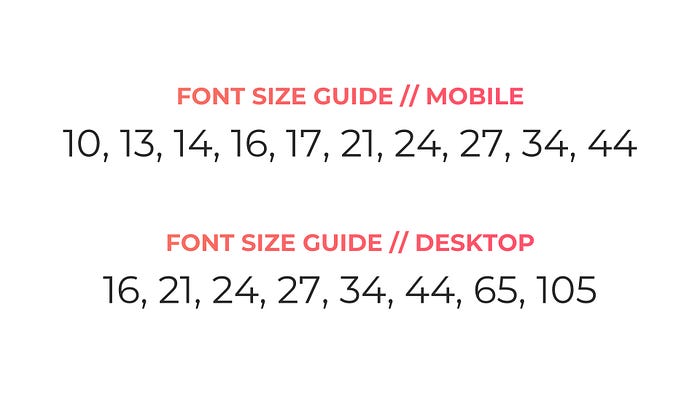
The Nitty Gritty — What Sizes to Use
Oh what a time it was to be alive during the era of HQ, the mobile trivia game hosted by Scott Rogowsky. Never won a game. But it was nice being called an HQutie. Before we dive into the actual font size values, let’s provide some foreplay. Or background, whichever tickles your pickle.
Two factors have helped us put together the ultimate list of values for font sizes. The first factor being the Apple Human Interface Guideline (HIG) and second being Fibonacci’s Golden Ratio (1.618). When blending both concepts together, we not only evade accessibility issues, but the resulting composition with these sizes together are magnifique. Some kill two birds with one stone. We killed three. (No animal was actually harmed when writing this article.)
The Takeaway
Like all great things (i.e. Alexander the Great’s empire), this article has now come to an end. Main idea? Font sizes are critical to helping users make informed decisions on how to use your platform. Please note — none of the ideas discussed in this article has to do with passage-based text. We’ll talk more about that next time. Today is all about you and you’re ability to optimize the user decision-making process by providing the user with great glanceable text! Think otherwise, and you might as well outsource your entire project to a remote island near Zimbabwe.
Remember, at the end of the day, bad design will always cost more than good design! 😉
Ready to create something awesome or transform your platform? Unlike anyone else in our industry, we can turn it around in less than 10 days, no matter the size of the project, and still cost 70% less than the national average creative agency price. Oh and all of our prices are up front, final, and transparent. So there’s no random agency fees that we can sneakily add on overnight unfortunately. Strictly located in the USA. Beat that and we’ll get on the next shuttle SpaceX off of this planet. Oh and we just won in six awards at the 2020 MUSE Creative Awards. So you could say our work is award-winning.
Let’s talk!
Originally published at https://www.creativemstudios.io.


