Enhancing user experience of the Skillshare Mobile App— UI/UX Case Study
This is a personal project. I was not commissioned by Skillshare to redesign their app

What is Skillshare?
To establish some context here…Skillshare is a platform for learning and teaching skills. The platform runs online courses across all areas of the creative industries, from advertising to fashion, writing to designing. It allows you to learn or teach skills with classes about a wide variety of topics. As its name implies, the focus is on applicable knowledge and skills.
Skillshare’s vision is to democratize learning by empowering teaching. To build a world where you can learn anything from anyone, powered by an endless cycle of learning and sharing passions.
They’re welcoming, friendly and generate curiosity. They convey these traits through their visual design.
Why did I choose Skillshare and Why Redesign?
I have been using skillshare for a long time to learn new creative skills. I loved how teachers were engaging, classes were organized and I gained hands-on practice with projects.
I was using the web version even though I had the Skillshare App on my phone which I never used. When I checked it out the user experience was not satisfactory and it made me take up this project, in the first place.
I thought of redesigning skillshare because
- I was a frequent user of skillshare and felt it could be improved.
- I wanted to work on an existing system to build an understanding of how the product currently works and their intent of design. Along with this, I wanted to work on real product problems.
In my understanding, the design proposed in the study, would lead to a better outlook of the app, and help in its growth. It is important to note that I do not have the exact numbers about the present users of the app. I have the utmost respect for the designers at skillshare and their respective design decisions.
What you will see in the project
I embarked on probably my most extensive personal project. What you’ll find below is a case study detailing my thought process and iterations to the potential solutions to the issues I see with Skillshare’s mobile app.
I did this project in 3 parts
- Existing user
- New user
- Teacher view
The Redesign


Now that you have seen the juicy part, let’s dig deeper
App Analysis
I began with a thorough analysis of the app and explored what existed and where there was room for further exploration.
Home Screen

There was a major flaw in terms of discovery and looking for new content.
Let's see how I worked with it
Not just improving the screen but also the experience

1. The first thing that I did was I changed the “ All categories” dropdown on the top right corner from local to global in the screen. Before it was just showing classes under only trending which was restricting the user to fully explore all classes within a category. I also moved the dropdown to the right side of the screen so it is more accessible in terms of thumb reach.
2. Next, I worked on the product cards as they were taking too much space, only one card could be seen in one scroll. Information like the teacher’s name is not a primary decision factor and does not need a lot of prominence.

I checked out other competitors to see how their product card looked like. It was evident that the title and thumbnail is the most important thing in a user’s decision making. After that, it comes down to the rest of the data points like “no. of hours”, “students”, “teacher”, “ staff pick”.
I ranked all these data points from 1 to 5 ranging from the most important to least. The new version of the card is also used by skillshare in their web version. While designing this, I also learned about the scalability of the card. What if there is a 3 line title? So I made sure that a larger title would fit the card and worked with the same data points and negative space. I made the cards smaller so more content can be shown in a single scroll.
3. The most frustrating thing was to scroll till the end to see all classes, it would take so much time and users might lose interest. I added the “View all” button against the title which lets a user see all the classes.
4. I added more sections like “Related skills”, “ popular classes” to have user explore more within a category as before there was only “trending” and “try a class” section for user to see.
5. I worked on the visual hierarchy for the main content, everything was catching the user’s attention at the same time.
6. Lastly, I made a few visual fixes in the search bar by reducing the shadow and made it more subtle.
Save Class

- Download section doesn’t show any status for downloaded classes and feels disconnected from the rest. I added the download section with the rest of the list and also showed download status.
- Also, I added “continue watching” another entry point to the classes to continue where the user left off.
Class Screen

- The position of Tabs below the teacher info was a little off in my opinion so I decided to move it to the top and also made it visually better.
- Added “ Illustration” tag to give the idea of which category the class belongs to.
- “723 reviews” feels like a link and doesn’t give the idea of the performance of the course. Also, it takes the user away from the main task to see reviews which is an extra step. So I added the “review” in the top tab, eliminating one extra step. I also gave a quick view of how is the course performing by giving a star rating.
- There was no way to download one single class only the whole class will be downloaded. Imagine a class with 40 videos 10–5 mins each. So I decided to add a download button against the video titles.
- “ Follow” doesn’t feel like a button so I made it more button-like.
Class Progress

Class Screen: About

The “about” tab doesn’t give any information about the class, doesn’t help in what you are going to learn. In my opinion, it was weird to see this information on the web version but not the app. I added sections which would give more information about the class and help a user learn more.
Introducing Gamification
A tip that I got from Chethan :
Take the opportunity to not just redesign the UI or UX of the app, but also find ways of improving the product as a whole.
Objective
The aim was to increase engagement on the app.
Users should feel fulfilled by seeing their progress measured in a visual way. If there is a disconnect with the gamified experiences provided, your product can end up feeling hollow and disingenuous.
For this, I had to build a system that would align with the skillshare working model and the user’s intention and motivation.

Intrinsic motivation would play a key role in this– the kind of motivation that comes from within us like progress, pride, or a sense of mastery.
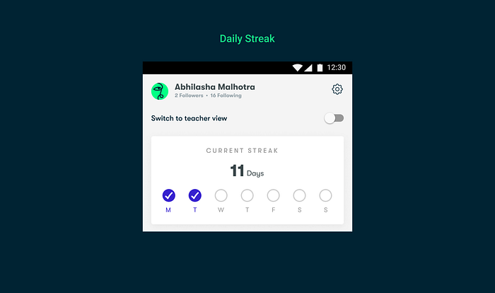
Streak
1st part in the screen — The daily streak will boost the chances of daily engagement and build more retention. keeping track of a user’s daily progress towards a completed action (finishing a lesson). They’re great for habit-forming as they provide positive reinforcement for action, giving the user a sense of achievement.
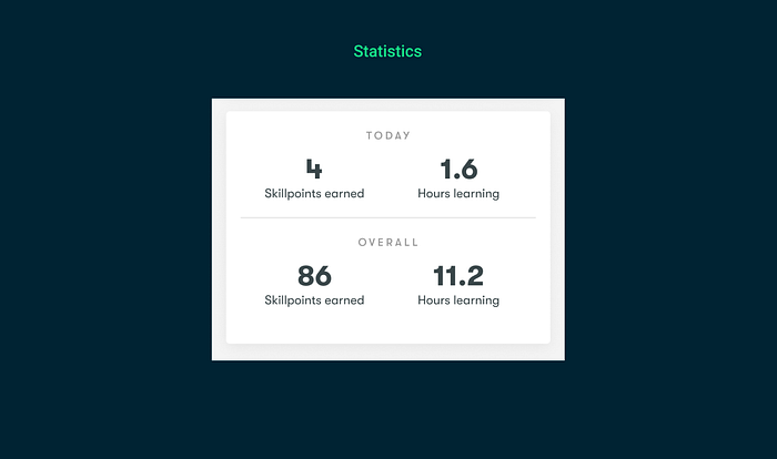
Statistics /Stored Value
2nd part in the screen-“Hours of learnings” and “Skillpoints” are game components which build with time as a user spends more time on the platform learning and also gives a sense of mastery.
“hours of learnings”-total number of hours the users spend learning
“Skillpoints”- points users gain as they complete classes or submit projects
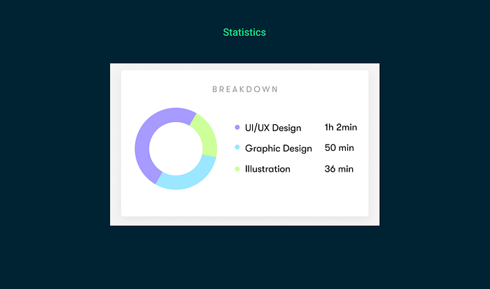
3rd part — The pie chart section keeps a track of what skills you are learning and how much time you are spending overall and in each category.
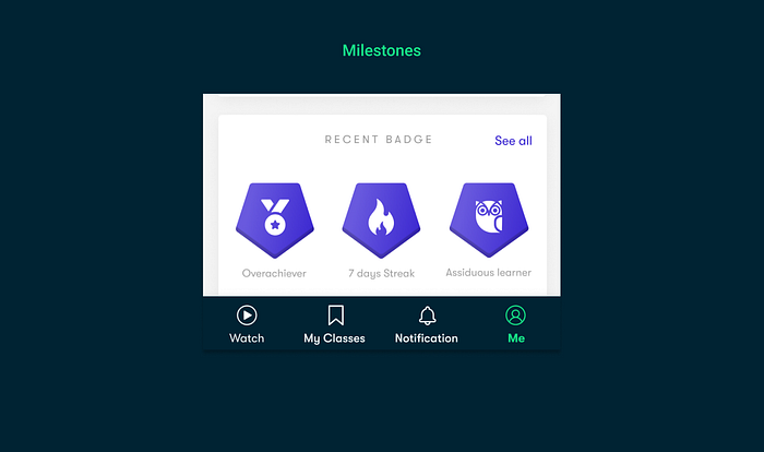
Milestones/Achievement
4th part-Receiving badges as you hit milestones which result in attaining a sense of accomplishment after each milestone reached.
All the iterations I made in order to reach the final results

Rating and Reviews

All the data points have been taken from the skillshare web version
The old review screen doesn't feel nice seeing at first and gives a vague idea of the performance. The hierarchy on the screen is off. Why would the name be given more importance than the actual review? I worked on all of these things.
But how do I leave a review?

This is the exact question I asked myself on one fine evening when I decided to leave a review in one of the classes I was taking so I opened up the app and there was no option to leave a review. So I had to open my laptop, visit their website and etc etc which was such a killer. It would have been so easier if I can do that on the app. So I designed this feature for the App.
Considering that the reviews are important for the students and also important for the creator to see how their content is doing and boost it more. I noticed a lot of classes didn’t have any reviews so I questioned why? and also realized that I wanted to leave a review because I was asked or somebody mentioned it.
So I designed the pop-up to ask students to leave a review after a certain no of classes or progress where a user would have high motivation and reason to leave a review.
For New User

So why another CTA?
CTA is very crucial to business and marketing success. The old flow directly asks you to start a free trial and enter card details without seeing what the platform has to offer. Now, I don’t have any data related to how many people are converting and etc
- In my opinion, it is the same as buying a box without knowing what is inside. Considering that I don’t have the data and it is a business call. I decided not to remove it and I added a secondary button “explore the app” which lets a user see the content of the app without subscribing. This is a really good way to let the users know that they have both options.
- When you enter the app, on the home screen all you see are irrelevant classes that you don’t want to see. I added the onboarding screen where user can select what category they want to learn and it gives a sense of a more personalized home page.
As a UX designer, it is not enough to design the eye-catching CTA and yell at your users everywhere. It is actually like a proposal. You need to hold your users’ hands and give them an irresistible speech at the perfect moment. At the end of the day, all they can say is “Yes, I subscribe.”
So I made a few changes to put them at the right moment and upselling the subscription model at different touchpoints.

Subscription Screen

- In the old screen, there were no benefits shown for upgrading so I added the benefits a user gets when they go for the subscription model. I also worked on aesthetics.
- In the annual plan card, the 359 per month price was shown but you pay the full amount of 4,308 in one go. Billed annually doesn’t convey how much amount will be deducted so I added the annual price on the card for a user to decide better.
Teacher’s View
Now, the creator on the platform gets paid and receives course performance data like any other platform. The problem is when a teacher is done uploading the course they check on the data regularly but the data can only be seen in web version which doesn’t come handy so I decided to incorporate teacher view in the mobile version so that teacher can easily access the information they need to see.

In the above screen, I added teacher view in the existing flow. I tried different iteration and settled on this one where a person can switch from student view to teacher view with a toggle button.
Teacher stats
Now that we have figured out how a teacher will access teacher view lets look at teacher stats which is probably the most important information for teachers and they check it regularly.
Let’s analyse web version and see what exists and what can be improved for mobile version

Mobile Version

- I categorize the information with two tabs “earnings” and “performance” to look at information easily.
- I kept the overall stats fixed at the top as it is universal information so it can be seen at all the times as numbers increase.
- Now, imagine looking at your bank account passbook and you cannot see your previous transactions but only your current balance. You will feel lost right? clueless about where the money went and where it came from? Previous month earning is as important as the current month earning/status. It is same as looking in your bank account passbook. I added the ability to access previous month earning in the mobile version as the web version didn’t have this feature.
- Lastly, I changed the list view of showing monthly earning to more of a visual bar graph which would help teachers in reading it better and compare their monthly earnings. Also over a period the list view would become more difficult to read and find information.


Widget
One of the most exciting parts of iOS 14 is — it’s widgets. Instead of once-boring app icons, the new wave of widgets let you spice up your homepage.
Chethan advised me go an extra mile and I created Wiget for Skillshare App with different sizes and considering different use cases. I thought about what is the most important information for which user return for or look for when they launch skillshare app?

Lastly Dark Mode ⚫️

And that’s a wrap…
Behind the scenes 😋

I’ve spent countless hours making sure that the visual craft is perfect in these screens. Each screen had multiple iterations before deciding on the final design. This included experimenting and exploring different approaches to solve a problem. A total of nearly 140 screens were designed and iterated before finalizing on the 25 final design screens. I also made iOS screens for all screens to learn about HIG.
Reflection
I started this redesign really as a challenge. A challenge for me to start a personal project, and to see it through to the end, and I’m so glad I did
It is only when you start designing something you begin to notice and understand the intent of design decisions and whys of the product. With this project, I learned about myself as a designer and learned to work with feedback.
A really big Thank You to Chethan for guiding me throughout the project, being someone who forces you to think, but doesn’t give you an answer, someone who chooses discussion over decision, someone who is not only my guide to designing, but helps me in shaping my thought process as well.
❤️ Thanks for reading!
This doesn’t have to end. Connect with me on LinkedIn and let’s chat about anything and If you liked my work then give a clap or two 👏 👏.