Delhi Metro App Redesign — UX/UI Case Study
Delhi Metro Rail, a rapid transit system in the National Capital Region of India is the world’s 8th longest metro system, running 343 Kilometers over 250 Stations. A project that started in 1998, it has come a long way to serve 2.8 million riders daily and become the second most popular metro in the world, after New York.
Amidst the world-class infrastructure and various awards, Delhi Metro missed the trick with their Mobile app which has a rating of 2.9 on iOS platform, courtesy to the mediocre user experience. Although the Android App has a better rating, people are still complaining down in the reviews section.
So, I decided to put on my UX Designer hat and dive in to have a look at the challenges faced by users and did a complete redesign of the app to improve the End-user experience.
Design Process
There has been much speculation around the choice of process for UX/UI Design, however, I recommend choosing the process best suited for the individual.
My process usually involves Topic & User research, Wireframing, Visual research, Visual Design & Prototyping, Validation & Testing. Not to mention, these often overlap and there are no defined boundaries.

Topic & User Research
Before diving into the design phase and prototyping, I needed some user inputs to make decisions accordingly. Here is how I collected user feedback.
How
I ran a survey to find out what makes people use the Delhi Metro App. People were asked to rate some features on a scale of 1 to 5. The survey received more than 100 responses from people of all ages, including people who are not residents of Delhi. Given below is a representation of the results.

From the results, it’s easy to conclude that most people use the Delhi Metro App for searching route between stations, followed by other features.
Next thing I did was go through the actual user reviews on the Google Play Store and iOS App store, Given below is the result and a few of the most frequent challenges faced by people.

Target User/Market
The app is generally used by people who use the Metro Train for daily commuting and by visitors who are in the city as a tourist.
When UX doesn’t consider ALL users, shouldn’t it be known as “SOME User Experience” or… SUX?
- Billy Gregory
The Metro App is used by people of all ages so the UI of the app needs to be easy and intuitive, and should not confuse people about the information that they are looking for.
Problem/Challenge
Let’s have a look at the most frequent challenges faced by user:
- No alternate smaller route suggestions for the travel
- Can’t see previously searched routes
- Not able to figure out the interchange stations, false interchange stations suggested
- Cannot check smart card balance (I did some research about this and came to know that it’s not yet possible to check smart card balance online, it can be only be checked at the Metro Stations. Hope DMRC overcomes this limitation soon.)
These are a few of the many challenges faced by commuters which lead to undesirable user experience.
Goal
Here are a few goals that I’ve tried to accomplish to make the customer experience enjoyable and increase user retention.
- Make it easy for people to view routes between different metro stations
- Suggest alternate routes, if present between different stations
- Allow people to view their previous searches
- Make use of research data to do a complete UI overhaul.
User Flowchart
Presented below is the flow chart that explains the user flow through various actions and screens. I’ve tried to minimize the number of taps needed by a user to accomplish a task.
Rule of thumb for UX: More options, more problems.
- Scott Belsky
Multiple taps to find out the route between two stations is the last thing you’d want when you’re late for your interview or a meeting. 😐
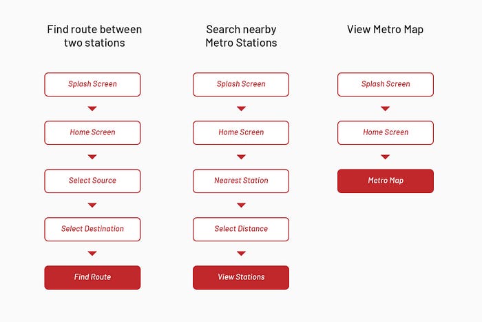
It’s clear in the above chart that the user doesn’t have to make repeated/irrelevant taps to perform the 3 most desired actions. The same follows for the remaining actions too.
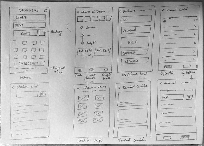
Wireframes
Let’s have a look at the wireframes before I started working on the high-fidelity prototypes. While designing the wireframes I have made use of the research data collected and designed a few basic wireframes for the start.
(Please try to ignore the handwriting, I know it’s bad.😅)
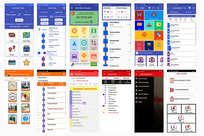
Visual Research/Inspiration Board
After completing the wireframes, I started checking similar applications and picked a few that I liked from the pool.
There are three responses to a piece of design– yes, no, and WOW! Wow is the one to aim for.”
- Milton Glaser
Final Design & Prototypes
And we’ve finally reached here, I know you’ve been waiting to see the final output.
The majority of the commuters using the app are trying to find the route between two stations, hence I have made the feature prominent on the home screen. The rest of the options are placed in order of visual hierarchy to make it easier for the users to skim through and quickly find what they’re looking for.
Let’s take a look at the current app home page and the newly redesigned homepage.

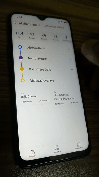
Next pain point where many users faced trouble was the inability of the app to show interchange stations/the inability to figure out the interchange stations. People also mentioned that they couldn’t view any alternative routes between the source and the destination. Let’s take a look at how I’ve tried to solve this problem.
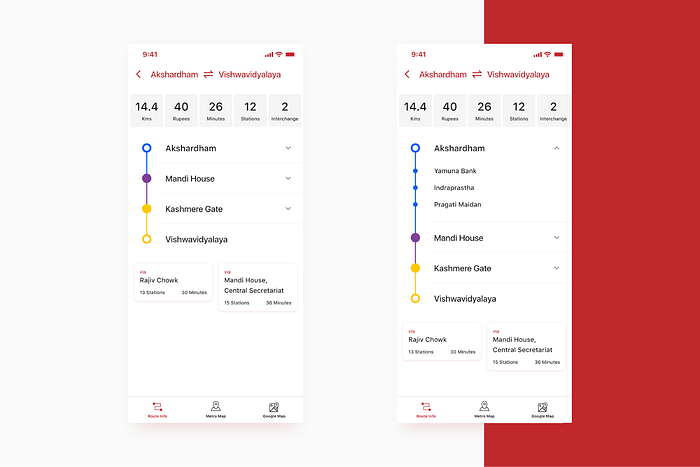
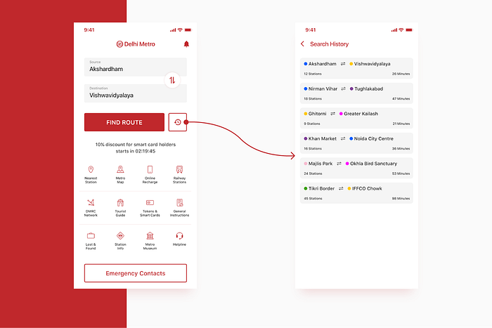
In my design, alternative routes are mentioned right below the destination station, with estimated commute time and total stations between the other routes.
Many reviews also mentioned that people can’t view their previous searches and need to search every single time to see the same route between two stations. Here is a glimpse at my solution to this problem. People can view all their previously searched routes now.
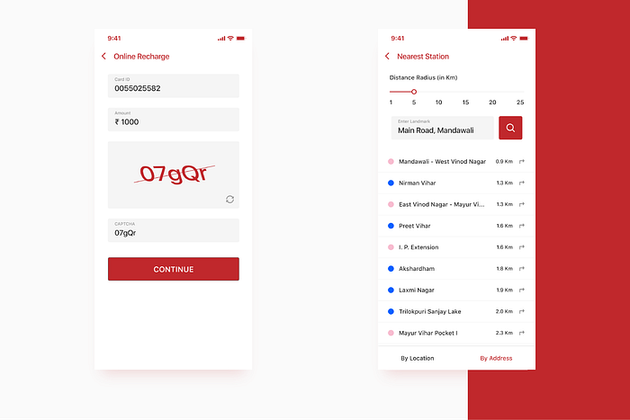
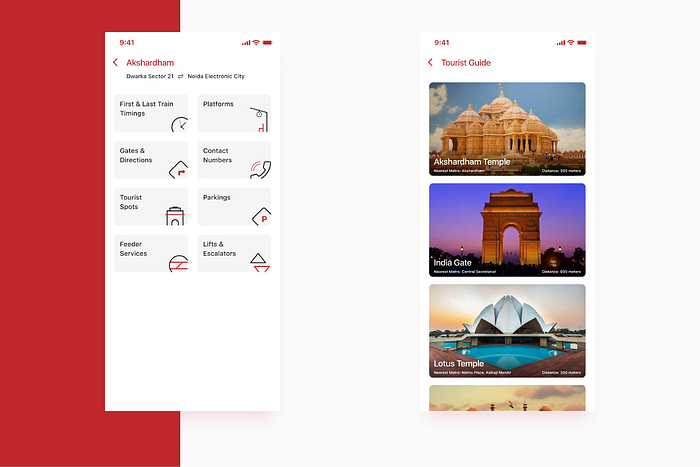
Following the same guidelines, I’ve also designed the remaining screens and you can have a look at them below.
Ease of use may be invisible, but its absence sure isn’t.
- IBM
While creating the UI, my main focus was to create an intuitive and easy UI that makes it a delight to use, unlike the current app.
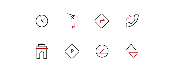
Icons & Illustrations
Here are the icons and illustrations that I did for this project.

Validation & Testing
And here comes the last and most intimidating part for designers. 😱
Jokes apart, after completing the final prototype, I walked out to get some feedback from users, I asked 5 people to perform certain actions on the current Delhi Metro App and the new prototype.
The results that I obtained have been summarized in the table below.
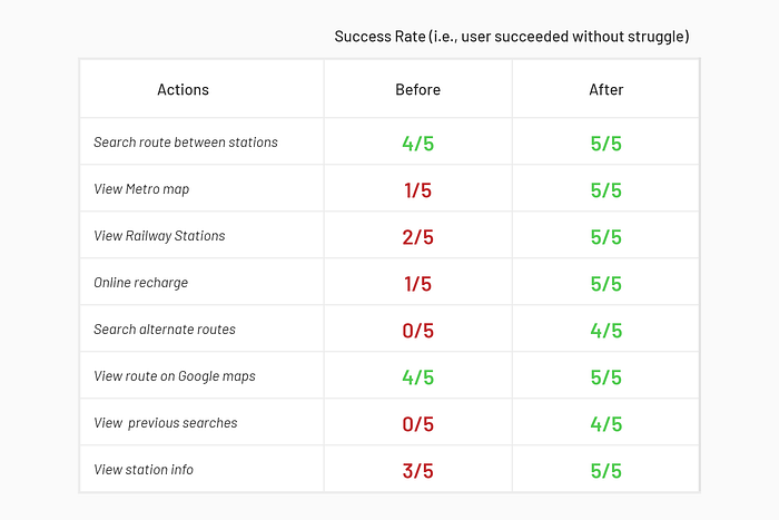
Note: This is just the prototype testing and the results might be different when the actual product is presented to the end user and there might be some new challenges that people might face. In that case, I would need to reiterate the prototype.
I do not work for, nor am I affiliated with, DMRC. I did this case study as I’m a regular commuter in Delhi Metro and as a Product Designer, I don’t really like the current Delhi Metro App Experience. I had much fun completing this project and learned a lot of new things.
If you’d like to view the complete project, click here.
Before you go
👏 50 Clap if you enjoyed this article, this will encourage me to write more!
Thanks for reading! If you want to collaborate, talk about product design, give some suggestions or just want to say hello, hit me up at aman1.7.97@gmail.com or connect via LinkedIn.
Update 1
I received feedback from a lot of users who said that they might not be in a state to go through all the contacts (listed in the emergency screen) in case an Emergency Situation arises and hence, it would be better to include the National Emergency Number 112 to be dialed automatically when someone presses the button.