Here is a quick guide on creating your own spatial computing application. Prepare to create apps and games for VisionOS! Discover the essential building pieces of spatial computing — windows, volumes, and spaces — and how to use them to create interesting and immersive experiences.
There is altogether a new OS for Vision Pro. Just like iOS for iPhones, iPadOS for iPads, and MacOS for Macbooks, It's VisionOS for the Vision Pro. All-new platform. Familiar frameworks and tools. Get ready to design and build an entirely new universe of apps and games for Apple Vision Pro.
Frameworks extended by Apple for Designing and developing Apple’s Vision Pro.
- SwiftUI: SwiftUI is a modern UI framework that makes it easy to create beautiful and responsive user interfaces for all Apple platforms. SwiftUI is declarative, which means that you describe what you want the user interface to look like, and SwiftUI figures out how to make it happen.
- RealityKIT: RealityKit is a 3D development framework that lets you create and interact with virtual objects in real-time. RealityKit is based on Metal, which is Apple’s high-performance graphics API. This means that your 3D experiences will be fast and smooth.
- ARKit: ARKit is an augmented reality development framework that lets you place virtual objects in the real world. ARKit is based on the TrueDepth camera system that’s found in many Apple devices. This means that your AR experiences will be accurate and immersive.
Altogether, SwiftUI, RealityKit, and ARKit can be used to create powerful and engaging UI UX experiences. For example, you could use SwiftUI to create a simple AR app that lets users place virtual furniture in their living room. Or, you could use RealityKit to create a more complex AR game that lets users interact with virtual objects in the real world.
Fundamentals of spatial computing on VisionOS.


Apple Vision Pro offers an infinite spatial canvas to explore, experiment, and play, giving you the freedom to completely rethink your experience in 3D. People can interact with your app while staying connected to their surroundings, or immerse themselves completely in a world of your creation. And your experiences can be fluid: Start in a window, bring in 3D content, transition to a fully immersive scene, and come right back.

- Windows: Each app can have one or more windows. These are SwiftUI scenes that can be resized and re-flowed as you would expect of a normal macOS window. They can contain traditional views and controls, as well as 3D content, allowing you to mix and match 2D and 3D. People can reposition a window to their liking in their current space, just as one might expect. You can create one or more windows in your VisionOS app. They’re built with SwiftUI and contain traditional views and controls, and you can add depth to your experience by adding 3D content.

- Volumes: Volumes allow an app to display 3D content in defined bounds, sharing the space with other apps. Volumes are great for showcasing 3D content, for example, a chess board. People can reposition volumes in space, and they can be viewed from different angles. Volumes are SwiftUI scenes, allowing you to do layouts in familiar ways, and they use the power of RealityKit to display your 3D content. Add depth to your app with a 3D volume. Volumes are SwiftUI scenes that can showcase 3D content using RealityKit or Unity, creating experiences that are viewable from any angle in the Shared Space or an app’s Full Space.
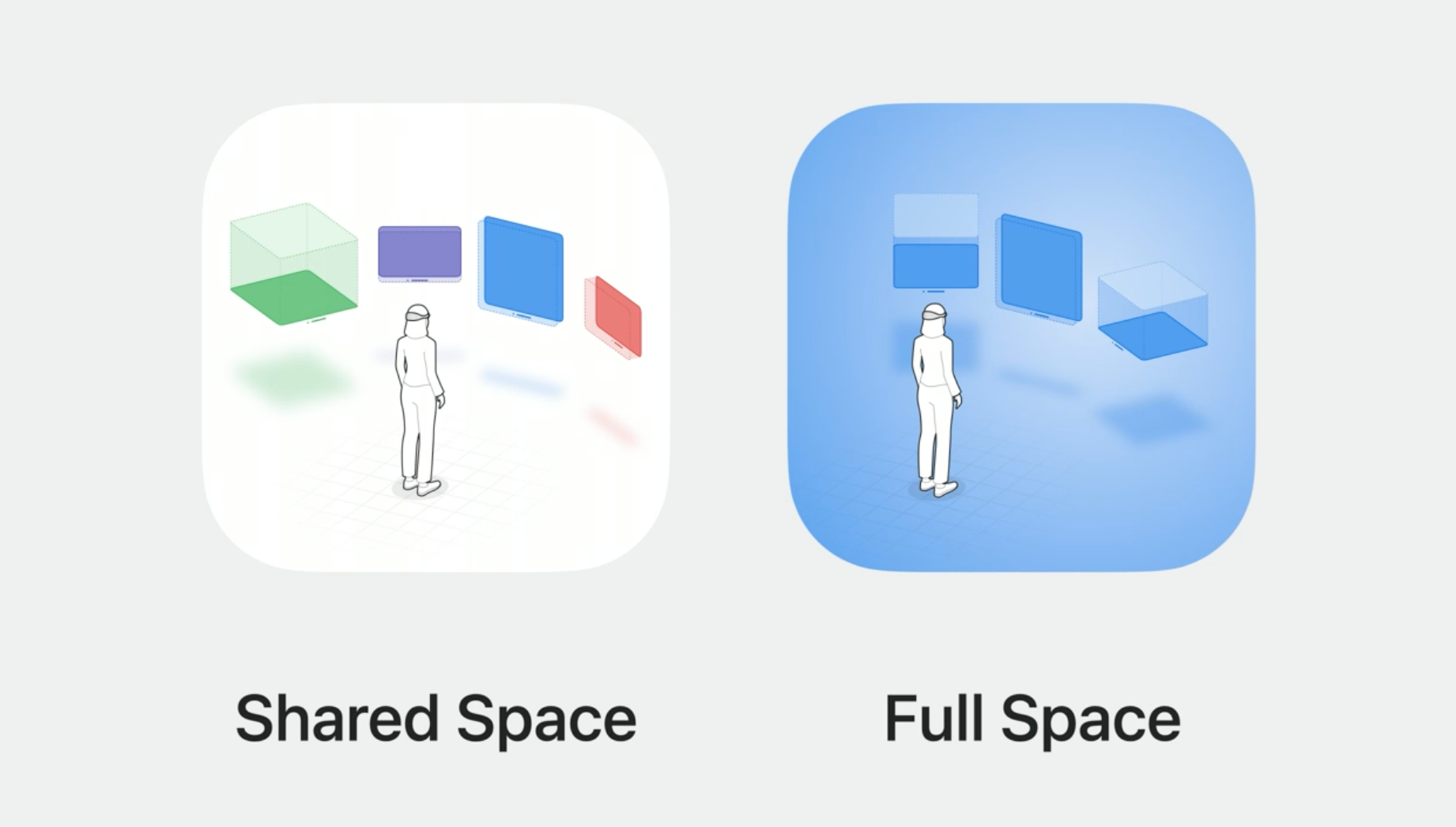
- Spaces: By default, apps launch into the Shared Space, where they exist side-by-side — much like multiple apps on a Mac desktop. Apps can use Windows and volumes to show content, and the user can reposition these elements wherever they like. For a more immersive experience, an app can open a dedicated Full Space where only that app’s content will appear. Inside a Full Space, an app can use windows and volumes, create unbounded 3D content, open a portal to a different world, or even fully immerse someone in an environment.
Sometimes you might want to have more control over the level of immersion in your app. Maybe to focus while watching a video or playing a game. You can do this by opening a dedicated Full Space, where your app’s windows, volumes, and 3D objects are the only ones appearing across the view. In a Full Space, you can also take advantage of ARKit’s APIs. For example, in addition to system-provided gestures, you can get more detailed Skeletal Hand Tracking to really incorporate the structure of people’s hands into your experience. Your app can use a Full Space in different ways.

You can use passthrough to ground content in the real world and keep people connected with their surroundings. making them feel that these virtual objects really belong in their room.
You can also choose to render a fully-immersive space to fill up the entire field of view. This allows your app flexibility to deliver on the creative intent of your app by customizing the lighting of virtual objects, as well as the ability to choose audio characteristics.
— — — — — — — — — — — — — — — — — — — — — — — — — — — — — — — — — — — — — —
let’s explore the ways we can interact with windows, volumes, and spaces.
On this platform, we can interact with apps by simply using our eyes and hands.

People can, for example, interact with a button by looking at it and tapping their fingers together to select. People can also reach out and physically touch the same button in 3D space.
For both these kinds of interactions, there is a variety of gestures that are possible, like taps, long presses, drags, rotations, zooms, and a lot more.
The system detects these automatically and generates touch events for your app to respond to. Gestures are integrated well with SwiftUI. The same gesture API works seamlessly with RealityKit entities. This allows people to easily interact directly with your 3D scene elements. For example, this could be useful to place a flag directly onto this 3D model, or imagine controlling a virtual zipper or perhaps you want to interact and pick up virtual chess pieces. You can do this through ARKit’s Skeletal Hand Tracking.
And finally, the system automatically brings input from wireless keyboards, trackpads, and accessibility hardware right into your app, and the Game Controller framework lets you add support for wireless game controllers as well. Collaborating and exploring things together is a fundamental part of spatial computing. We do this through SharePlay and the Group Activities framework.
— — — — — — — — — — — — — — — — — — — — — — — — — — — — — — — — — — — — — —
Shareplay and Shared Context

On this platform, as on macOS, people can share any window, like this Quick Look experience. When people share a Quick Look 3D model, we sync the orientation, scale, and animations between participants, making it easy to collaborate while being in different locations. When people are collaborating on something that is shown in their space and that they physically point at, it is important that everyone in the SharePlay session have the same experience. This enables natural references such as gesturing to an object and reinforces the feeling of being physically together.

Apple has added another concept of shared context to the system. The system manages this shared context for you helping make sure that participants in a SharePlay session can all experience content in the same way. You can use Spatial Persona Templates to further customize how people experience your content.
— — — — — — — — — — — — — — — — — — — — — — — — — — — — — — — — — — — — — —
Let’s Understand how Apple and Privacy First company hold their promises.
Privacy is a core principle for guiding the design of this platform while making it easy for you as a developer to leverage APIs to take advantage of the many capabilities of the device. Instead of allowing apps to access data from the sensors directly, the system does that for you and provides apps with events and visual cues.
For example, the system knows the eye position and gestures of somebody’s hands in 3D space and delivers that as touch events. Also, the system will render a hover effect on a view when it is the focus of attention but does not communicate to the app where the person is looking. For many situations, the system-provided behaviors are sufficient for your app to respond to interactions. In cases where you actually do need access to more sensitive information, the system will ask the people for their permission first.

Now we have a grasp on the fundamentals, let's understand the Core principles of Spatial Computers.


Familiar:
Common elements like sidebars, tabs, and search fields help people find the music they’re looking for. On a spatial platform, people should be able to find their music just as reliably, using elements they recognize and know how to use. We place interfaces within windows so people can comfortably see them and use them. People are familiar with app windows, but on this platform, windows live in your space and feel like part of your surroundings.

Let’s discuss windows, understand how to find the right size for them, and discuss the points system.

- Windows: Apple has designed Windows with a new visual language. The glass material provides contrast with the world, gives people more awareness of their surroundings, and adapts to different lighting conditions. The system provides controls to move, close, and resize windows. People can grab the window bar to move windows anywhere around them.

- Sizes: Windows are designed to fit comfortably within people’s view but they are super flexible, stretching to fit any size. Choose a comfortable window size based on your content.


For example, Safari is tall so people can see more of the web page, and Keynote is wide to fit full-size presentations. Windows can have flexible shapes too. Use tab bars and toolbars to push outside the window, like here in the Music app. These controls are layered above the main window, so they’re always accessible and provide more room for the content. Or use multiple sections to separate controls from content. Here in Safari, the navigation bar is set apart from the web page to let the page take the focus. And windows can change size too. When the sidebar is opened in Safari, the window grows, showing more controls without covering the web page. Windows aren’t bound by a screen, so they should remain smaller when possible to avoid blocking too much of people’s view. Think about how your app can be flexible and dynamic, changing its shape and size based on the context.


If you need a larger canvas, you can give yourself a larger canvas. And like other platforms, apps can have multiple windows, which are useful in certain cases. They can display content side by side, like viewing multiple web pages at once, or show distinct actions meant to be used together. Here in Keynote, when playing a presentation, the slides are in one window, large and far away, while the presenter display is in a smaller window nearby. This lets people place the presenter display where they want while keeping the slides nice and large. Ideally, keep your app’s interface in a single window. Multiple windows can quickly become a lot for people to manage.


- Point System: Design with points. This is a concept you’re probably already familiar with. Points are the way we specify the size of interface elements, describing our interfaces in a way that adapts to other screens. On this platform, as people move windows, they scale larger as they move away and scale smaller as they move closer to them. This keeps interfaces legible and usable.


And if you’re used to points on other platforms, they’re a familiar way to set the size of interface elements like buttons with the same units you already know.


— — — — — — — — — — — — — — — — — — — — — — — — — — — — — — — — — — — — — —
Human-Centered:
Good design is always human-centered, but now this takes on a whole new meaning. People wear the device, use their eyes and hands to interact, and experience apps through their own view in their own space. When designing spatial apps, think about what someone can see and how they might need to move.

- Field of View: Let’s start with what people can see. When people wear the device, they see the world in front of them. This is their field of view. It’s easiest to see things in the center, so place the most important content there. And the field of view is wide, so use landscape layouts.

Here’s an example. In Safari, when people want to see all their tabs at once, we spread them out in a grid. This layout is wide to match people’s fields of view. The tabs scale down so they’re not too far from the center, and the tabs on the sides turn inward so they’re easier to read. But people don’t keep their heads perfectly still, they look around. This means we can extend content further for immersive experiences, but in general, keep your main content within the field of view, or else it’s difficult to read or comprehend all at once.


- Ergonomics: The placement of your content has a big effect on how people react physically. So place objects comfortably in all dimensions. By default, windows are placed along a natural line of sight to encourage a healthy and comfortable posture. When placing your own content, place it relative to the person’s head in the direction they’re facing. This helps people see and interact with your content and accounts for people of different heights and in different positions, like laying back on a couch.

Most of the time, place content away from people, a bit further than arm’s reach, to encourage people to interact at a distance. Avoid placing content behind people or extremely high or low unless it’s part of an immersive experience. Not everyone will be seated in a way where they can move around to use your app.
And avoid anchoring content to people’s views. This makes things feel stuck and can be disorienting. Instead, anchor content in people’s space. This gives them the freedom to look around naturally.


- Movement: people can also get up and walk around. But its recommended creating stationary experiences that require minimal movement. This makes your apps easier to use for everyone. Unless it’s a core part of your experience, people should be able to use your app without needing to move at all. Sometimes people do move to a new seat in their room or face a different direction. When they settle, they can press and hold the Digital Crown to recenter. This moves content back in front of them. Your app doesn’t need to provide a special way to bring back windows or reset the scene. Instead, rely on this system as a way to reposition your app’s content.
— — — — — — — — — — — — — — — — — — — — — — — — — — — — — — — — — — — — — —
Dimension:
- Space: Great apps take advantage of the space around people. And while the canvas is infinite, people’s physical space may be limited. Design your app to work well in any amount of space, because you don’t know where someone might be using it. Also, be careful not to constrain your app by the physical space available.

Let’s see how this works with the TV app. Here, a window is moved through a chair in the room. The chair is still visible while the window is moving to make it easy to place.

When the window is released, the content becomes visible so people can see and use the app. With windows, you don’t need to worry about how they fit into someone’s space since the system handles this for you. When it’s time to watch a movie, the video takes over the entire window, and the passthrough is darkened.

Dimming is a simple yet powerful way to maximize space. Even though the movie might overlap the physical room, dimming helps people focus on the content. This is a great balance. People are still aware of their surroundings without being limited by them.
- Depth: Giving apps dimension means using depth. On this spatial platform, depth is a new variable. It’s a powerful tool for hierarchy and focus.


Let’s look at some examples. Depth affects how we relate to objects in space. Content far away can be nice and large and encourages people to interact at a distance. Nearby objects invite interaction and are easier to inspect at different angles. A small movement allows us to see the object from all sides. A great use of depth is to create a hierarchy.

Let’s take another look at the TV app. In the immersive cinema, the playback controls are placed small and nearby. Even though they’re small, it’s still clear that they control the movie. If they were placed on the movie screen, they would look too large and out of place. Nearby elements like these can remain small but still take visual precedence over large objects far away.


Depth needs to be reinforced with visual cues like light and shadow. Some objects emit light, like the movie screen we just saw. The light shines onto the floor and ceiling, highlighting its position in the room. Any object that appears to emit light should shine color onto nearby objects.

And most other objects should cast a shadow, like this window over the table. This grounds them and makes them look more integrated into the space. Any custom objects in your app should cast shadows too. In most cases, prefer subtle depth. It’s easy to overdo, making things look distracting or unrealistic. Subtle depth between elements is often enough to direct people’s attention.
- Scale: Like depth, scale is a new way to emphasize your content. Small objects feel personal and lightweight. Large objects feel impressive, like a giant movie playing over a lake. Increasing the scale completely changes the feeling of the movie.


- Some objects are best viewed at their real-life scale. For example, a shopping app may want to display products as they appear in real life. Explore different scales for your content. Try making things really big or try them really small, and see how the scale makes it feel.

— — — — — — — — — — — — — — — — — — — — — — — — — — — — — — — — — — — — — —
Immersion:


- Immersive Spectrum: On this platform, an app can be dynamic. It can fluidly transition between different states of immersion, depending on where people are in your experience. This spectrum offers so much flexibility. You can enhance someone’s view or bring them to a new place and everything in between. Your app can be within a window in the Shared Space alongside other apps. Or if it needs more room, it could run in a Full Space, where other apps are hidden. Try to start your app in a window in the Shared Space. This will give people control over how immersed they want to be.


Let’s look at an example. In Keynote, the app opens in a window. But when it’s time to play the slideshow, use dimming to bring focus to this presentation. Dimming is a simple way to create contrast between your content and people’s surroundings without taking them out of their space. When it’s time to rehearse the presentation, we can bring people onto the big stage fully immersing them in the theater. Life-size experiences like these require more room, so Keynote is now in a Full Space, and other apps are hidden. Immersive apps can also feel connected to people’s physical surroundings.

Here, a big welcome moment casts a shadow across the table, making “hello” feel like it’s really there. If your experience relates to someone’s physical surroundings, remember to keep your design flexible. Not everyone’s space is the same, and spaces tend to change over time, so make sure your experience can adapt to work well anywhere.
- Essential Tips: In designing immersive experiences, there’s a new consideration. People can look around and pay attention to different things, but if too much is happening all at once, they might feel overwhelmed or unsure of what to do. This is why it’s important to guide people’s focus toward parts of your experience that matter the most. Remember to design smooth, predictable transitions like these to create continuity between different states of your experience. This will keep people feeling comfortable and aware of what’s happening.
- Another important tip is to blend thoughtfully with reality. If your app’s in a Full Space, you can use the shape of a room to anchor content or create physical interactions. An awareness of someone’s surroundings allows you to blend your content meaningfully within it. When you’re blending entire scenes into someone’s space, make sure to use soft edges to smoothly integrate your app. This avoids abrupt transitions and keeps people focused on your content. The most inspiring experiences make things feel alive. Subtle animation can bring liveliness to a scene, like water rippling on a lake or clouds floating through the sky. Subtle motion can transform a static experience into something alive and dynamic. And to enhance things even further, create an atmosphere with sound.

- Comfort: If you need to move your immersive app or someone’s position within it, make sure to avoid large, fast movements. This could feel disorienting. Instead, we recommend fading out content while it’s in motion and fading it back in once it’s settled. This will keep people feeling steady. If people physically move in their space, immersive experiences will also fade out. This shows people their physical surroundings while they’re in motion.


— — — — — — — — — — — — — — — — — — — — — — — — — — — — — — — — — — — — —-
Authentic:
When creating any great app experience, it’s important to take advantage of the unique capabilities of the device. On this platform, the best apps are rich, immersive experiences that make use of people’s space. Apps shouldn’t be quick things you jump into for a minute.

Freeform, for example, puts you in a big creative space where you can see all of your content at once to focus on your project. Think about how you can make your app worthwhile, engaging, and distinct enough that people will welcome your experience into their space.
An Important question: Why would someone build an app for a spatial computing device with other screens?
By focusing on one unique aspect of your app or game that can be spatial or immersive. To do that, find a key moment that can only be experienced spatially. Let’s look at how it is done in the Photos app. Apple looked at core features of the Photos app that people were already familiar with on existing platforms. Browsing your Photos library, rediscovering special memories, and reliving a place through panoramas.

Finding your favorite photos should be easy. A window interface and familiar navigation help you get to what you’re looking for quickly.

But when you find that special shot, the photo grows big in your space and dims your surroundings. These are the same great memories on your iPhone, but seeing them at a lifelike scale is truly magical.

Remember dimming to showcase emphasis.
And when it’s time to view a panorama, have a key moment, taking you back to a special place to feel like you’re really there. Here, panoramas transport you in a way that’s only possible with infinite space.

One more important thing to keep in mind while designing for Spatial computers?
Vibrancy apart from everything: like system fonts. Next, let’s talk about vibrancy. This is one of the most important details to maintain legibility across the system. Vibrancy brightens foreground content that displays on top of material and works by pulling light and color forward from what’s behind it. On this platform, since the background can be constantly changing, vibrancy updates in real-time to make sure your text is always legible. To show what I mean, let’s look at an example. Vibrancy works on top of the glass material, enhancing legibility and making system materials feel richer and more sophisticated. Make sure to use the system components when possible. By default, they take advantage of this vibrancy effect.