All You Need to Read to Get Started on Mobile UX Design
There’s a lot more to it than resizing the elements

Nomophobia, yes, there’s a phobia of being out of cell phone contact. While most of us don’t have that phobia, but we are always concerned about where our phone is.
It goes without saying that mobiles have become an integral part of our lives. It has changed we interact with each other and with businesses all over the world. In fact it’s almost as if we carry around a window to the world, in our pocket!
If you’re someone who just started off being a UX Designer, or someone who just uses a phone for even an hour a day, this is worth your read. We’ll talk about what makes designing for mobile different and also places to start for beginners.
Before we divulge into the details, let’s understand what makes a mobile phone in terms of design.

What’s Different About Designing for Mobile?
One prerequisite to designing good experiences is to understand the platform itself. The design is often molded by the constraints around it. In this case, the device itself is the constraint. Let’s spend some time understanding our platform — the mobile phone.
A mobile phone is much more personal
From crowded malls to bustling restaurants, from a cashier who’s facing the heat from a customer in the queue to a tourist visiting the Taj Mahal, people use mobiles in a lot of places — almost everywhere. Often in conjunction with the “main task”, they’re doing.
If you’re someone reading this from the loo, I’m talking about you as well!
This is simply because it’s portable. They don’t call it a mobile phone without a reason.
Someone using a desktop or a laptop usually has a stable place for himself. But when it comes to mobile, people use it everywhere they can.
The way users input data is different

One key differentiator of mobile is that they don’t need a mouse or a trackpad. The phone serves both as an input and a display.
Ever wonder why every letter typed shows a preview? That’s because our thumbs block the key that is being pressed.
What does this mean?
A lot of things. The environment in which users use their mobiles competes for attention. Most of the times, they would not be fully able to focus on your app!
Our goal then is to give them what they need at the earliest. Users should be able to
- Quickly find what they intend to
- Interact with your app with a negligible additional cognitive load
- Chunk information in easy-to-digest bits.
How can you solve it?
There are a lot of ways to solve these problems, however, the key concepts are
- Wherever relevant, show indicators of progress. — Nobody likes looking at a stuck screen, especially in the case of mobile. With no indicators of progress, you have lost their attention and they’ll put the phone away, or worse, rate your app as a slow one.
- Show them a quick way out — Yes you’ve heard me right. Because you’re already competing for users’ attention, the more you prolong, the greater is the drop off rate. Word of caution though — when you’re trying to collect important information like payment details, users have to feel confident. On the other side of this coin, checkout experiences are best designed to be as quick as they can get.
Size matters
The size of the phone plays a key role. Here are the heatmaps for iPhone sizes since 2007. As you can see, the green is where users are the most comfortable reaching with their thumbs. We need to be aware of this behavior in designing experiences. A sore thumb is the last thing your user will need. (This is just as bad as screen freeze).
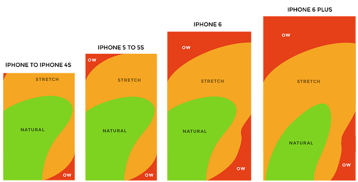
Another key consideration to make is the size of the action items. Ideally, a tappable area of 44pt x 44pt is suggested as this gives users ample space to interact. This also avoids mis-taps.
Keep an eye out for latest patterns
Design doesn’t happen in a vacuum. Great design inspires great design. We should strive to create things that inspire someone tomorrow.
A lot of us take inspirations for granted. Some feel guilty about copying while some are too proud to even look at someone else’s design. Both schools of thought have their flaws. To derive inspiration from a design doesn’t imply we’re copying afterall, good artists copy; great artists steal.
This is in no way to say that stealing someone else’s work is okay. It’s just that you’re opening yourself up to what is out there.
Think of it from the users’ perspective. Your app isn’t the only app your users will use. As they use other apps, they build some sort of a visual vocabulary. These are quick representations of ideas. For example, “+” always means add/new. Sticking to some key patterns has its own advantages.
- This helps them navigate through the app solely on muscle memory. This helps them make quicker and meaningful decisions
- Every new pattern is an additional cognitive load on the users already busy life. They would rather interact with something similar, something they’re comfortable with.
One inspiration source that I always have a tab on is Muzli.
Where to get started?
Design guidelines are a basic set of design considerations for a platform. While these are a good place to start, these are usually written by platform owners with an aim to create a coherent experience for users across different apps.
Apple:
Android:
Windows:
GUI Kits
With a good understanding of the guidelines in place, you can now look at the UI components that can be used. Different publishers have different copyright clauses, so be careful!
Facebook iOS GUI
Material Design Sticker Sheet
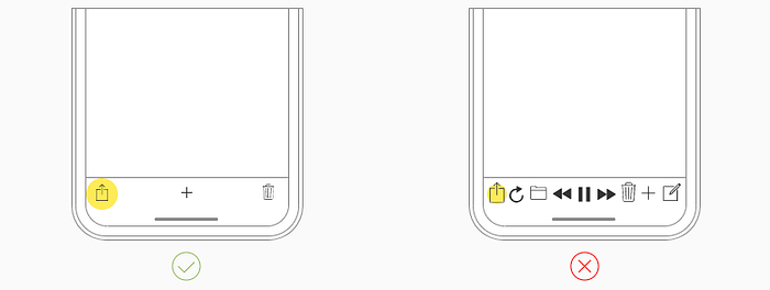
Where you preview is important
One important thing we often forget is to preview mobile designs on an actual mobile. Previewing on mobile vs previewing on a monitor. Hey isn’t that the same deal? The answer is no.
Previewing screens on mobile is critical to design a great mobile experience. Here are a couple of reasons why.
- Viewing distance and angle change — this is a major reality check for your design.
- It gives a good sense of how usable and practical the design is. Is the action item big enough for the users to tap? Does it have sufficient contrast? Is it easy to reach? Can it be easily related to content? These are the key questions that are answered.
For iOS
For Android
Designing for mobile is designing an experience. It takes a lot more than resizing that icon or two. What interesting problem are you going to solve? Found something interesting? Let’s talk!
Further reading


